SoloMontage
SoloMontage is a travel companion targeting solo travellers, providing personalised recommendations and suggestions along with innovative safety features for an enhanced and secure travel experience.
Team
Me + 3 members
Duration
5 weeks
Role
UI designer, UX researcher
Tools
Figma, Illustrator
I CONTRIBUTED TO
Brainstorming
User research
Empathy map
User journey
Wireframes
UI design guidelines
User tests
Usability tests
Hi-fidelity prototype
PART 01
Project Overview
WHAT’S THE PROBLEM?
Excel spreadsheets. Dodgy airline deals. A hundred tabs open. Tedious hours dedicated to deciding between an Airbnb with a heater or one with carbon monoxide alarms.
These relatable experiences, for those of you lucky enough to travel, bring back PTSD-like flashbacks before you finally exhale a sigh of relief at the airport you've pooled your savings for. But the struggle doesn't end there. Plans change, laws in other countries are different than what you expected, and traveling solo can feel unsafe.
We found that there was a gap in the market for an efficient and flexible solution to the tedious trip planning process that also ensures solo travellers feel safe.
SO HOW DO WE MAKE THE TRAVEL EXPERIENCE SAFER AND MORE SEAMLESS?
To address these issues, we conceived SoloMontage - an all-in-one travel companion app that offers simplified trip planning and unique safety features.
We needed to streamline the research and planning process and found power in personalising experiences through recommendations and flexible itinerary edits on-the-go.
To address key solo traveler concerns around safety and security, we implemented unique safety features such as safety zone maps.
I adopted the double diamond design process, enabling a structured exploration of the problem followed by iterative development of potential solutions.
However, I discovered that the decision process isn’t always a straightforward journey and involves tweaks and adjustments to adapt to the uniqueness of problems and solutions.
PART 02: DISCOVER
Understanding the User & Space
WHAT’S CURRENTLY OUT THERE?
Wanderlog
Uses AI to generate personalised recommendations for places to go, restaurants, and sights to see based on user preferences
Allows users to collaboratively plan trips with others by sharing and editing itineraries
Main differentiator is the AI-powered recommendations that adapt as the user adds more places and preferences
Hopper
Focuses on saving users money through predictive algorithms pinpointing best flight/hotel deals
Does not provide personalised recommendations for places to explore
Specialised specifically for booking travel, not for in-destination recommendations
Google Maps
Most popular maps/navigation app
Provides basic recommendations based on user search terms and ratings
General purpose, not customised specifically for travelers or solo explorers
Strength is accuracy of business information and integration with Google services
Rome2rio
Multi-modal trip planning focused on transportation from point A to B
Uses AI to surface different route/transport combinations
Very niche in terms of only providing info around transit to a destination
SoloTraveller
Connects solo travellers to meet up with other individuals or groups
Enables safety in numbers and meeting like-minded explorers
More social in nature rather than using AI for activity recommendations
PackPoint
Uses AI to create personalised lists based on weather, trip duration, activities
Allows users to customise and save packing lists for reuse
Offers handy checklist feature to track packing status
HEY TRAVELLERS, WE HAVE QUESTIONS FOR YOU
After getting a feel for what’s already out there, their strengths and weaknesses, we wanted to connect directly with our target audience through questionnaires.
We distributed a questionnaire on Google forms to travel enthusiasts (aged 18-40) interested in solo travelling, collecting 90 responses. The questions focused on user preferences, concerns and motivations in order to gain insight into the typical psyche of a solo traveller.
What did this tell us about why people wanted to travel solo?
Self-healing/discovery
Exploring cultures
Independence/freedom
Some Data-backed Insights
Safety was dominant as a top priority and concern for most traveller enthusiasts
Half of the responders fell between having a relaxed or organised, yet flexible style when travelling
Responders want to see features that help make trip planning more efficient and saves time researching critical information such as visa/flu shot requirements and currency exchange
Top Priorities When Solo Travelling
Top Concerns When Solo Travelling
Which Type of Traveller Do You Identify Most With?
LET’S GET TO KNOW YOUR TRAVEL DESIRES 1-ON-1
For a more in-depth exploration of what users demand or seek, to improve their travel experiences, we conducted interviews with 6 users who have solo travelled before to delve into the frustrations of their current trip planning process and what would improve their future trips.
"The app could enhance my experience by offering more activity recommendations during my downtime between schedules."
Response from interview
"I would feel unsafe solo travelling just because girls are more prone to dangers."
Response from interview
More closely, we found that:
83% of users (mostly younger) rely on social media for reviews and suggestions while 17% of users (mostly older) favour reputable websites such as Tripadvisor for dining and activity suggestions.
Users emphasised that safety prevails as their foremost worry, particularly girls, reflecting the questionnaire results. This pivotal concern guided our decision to centre the app around recommendations and safety measures.
Users wanted the options provided by activity recommendations to accomodate flexible itineraries whilst on the trip
PART 03: DEFINE
Interpreting Findings
We sorted the notes from the market research, survey and interviews and categorised them to find commonalities. After synthesising and analysing our key findings, we identified 3 key insights:
Safety
Physical, cultural, and legal safety emerged as the top concerns for travel enthusiasts, necessitating a strong understanding of political climates, laws, and cultural differences in other countries.
Efficiency
Users wanted to save time manually browsing the internet and social media for recommendations and reviews that might not be reputable or reliable.
Flexibility
Users required ways to accommodate flexible alterations to the trip plan whilst on the trip
WHO ARE WE DESIGNING FOR AND WHAT IS THEIR JOURNEY?
To hone in on who we’re designing for, I developed a persona of our ideal user using the insights gathered from primary and user research. This serves as a guide to our design decision to ensure that we’re constantly thinking about the users we’re targeting.
In addition, research insights shaped our user scenario and storyboard which visualises the entire journey and psychological and practical benefits of using SoloMontage.
I also created a user journey map which focuses specifically on the potential emotions, thoughts users might undergo whilst navigating a solution designed to enhance travel experiences and safety.
These methods helped facilitate the analysis and identification of critical challenges and pain points to mitigate in the development of our solution.
WHAT IS THE PSYCHE OF WHO WE’RE DESIGNING FOR?
Using insights from user research, I created an empathy map to map out what our target user’s behaviour, thoughts and feelings would be whilst solo travelling. This enhanced our understanding of the user’s psyche to further guide the development of an empathetic and user-centric solution.
REVERSE THINKING
Using the reverse thinking ideation technique, we generated multiple concepts that we transformed into a working solution. We wanted to think outside the box by identifying ways to worsen the problem before reversing these ideas to find solutions we wouldn't have thought of with a traditional problem-to-solution route.
✈️ How can we make trip planning even MORE frustrating and stressful and make travel more dangerous?
Brainstorming "Bad" Ideas:
Make Information Hard to Find: Scatter crucial details about visa/flu shot requirements, currency conversions, news, emergency services, sim card options, flights, accommodations and reviews across obscure websites, apps and government archives with outdated interfaces.
Confusing and Conflicting Information: Make information across all these apps inconsistent and contradictory. Information is only found through unreliable sources and scammers.
Homogenised Recommendations: Recommend restaurants and attractions with zero consideration for the traveler's location or interests. Flood them with generic "top 10" tourist traps, ignoring hidden gems and local favourites.
Flight and Accommodation Chaos: Force travelers to compare hundreds of identical flight and accommodation options with no filtering or sorting tools. Offer no option to compare prices based on desired features or budget limitations.
Unreliable Safety Measures: Make solo travel dangerous by offering no emergency contact options or local safety resources.
Offline Inaccessibility: Make crucial information about emergency services, currency conversion, and sim card options unavailable offline, forcing travellers to rely on expensive roaming charges or potentially unreliable internet access during unsafe situations.
Reverse the "Bad" Ideas to Find Solutions:
Seamless App: Integrates all travel information needs, including:
Visa/flu shot requirements checker with timely updates
Real-time currency converter with clear exchange rates
Daily news digest with curated, location-specific content
Local emergency services directory
Sim card purchase and activation options within the app
Consolidated flight comparison tool with filtering options for price, duration, and amenities
Comprehensive accommodation comparison platform based on user preferences
Personalised Recommendations Engine: Develop an AI-powered recommendation engine that learns user preferences and location to suggest restaurants, attractions, and hidden gems relevant to their interests and travel style.
Real-time Updates and Offline Access: Ensure all information, including recommendations are up-to-date according to location and offline access if available for crucial details like currency conversion and emergency contacts.
Solo Traveller Safety Features: Develop features for solo travellers, like emergency contact options, safety zone maps, daily news and real-time alerts for potential dangers.
Don’t forget to rest your eyes and take a break from scrolling…
PART 04: DELIVER
Wireframing, User Testing & Iterating
Wireframes
→
User Test
→
Visual Identity
High-Fidelity
→
User Test
→
High-Fidelity 2
Final Design Outcome
WIREFRAMES
A detailed rendering of specific interactions and user flows was digitally crafted in the form of wireframes turned low-fidelity prototypes. These served to lay out the core features early in the prototyping stage to refine any heuristics issues.

Title Screen

Login
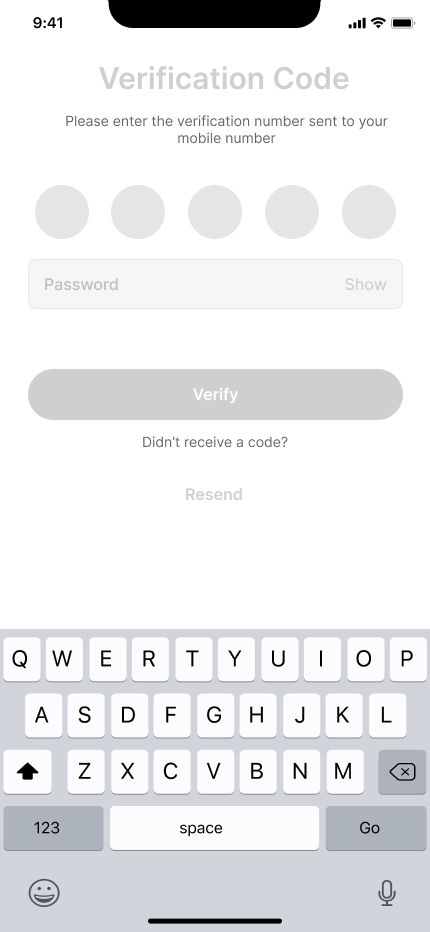
Verification
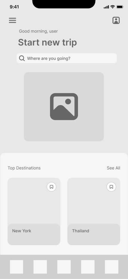
Homepage - Default
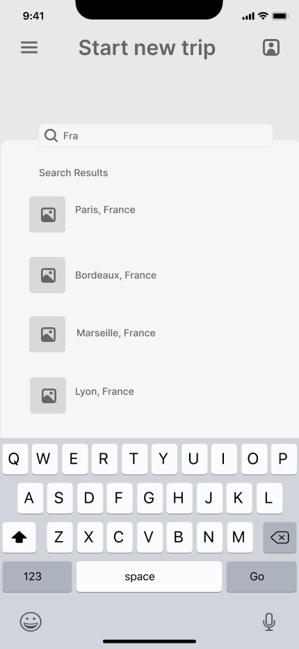
New Trip

Questionnaire
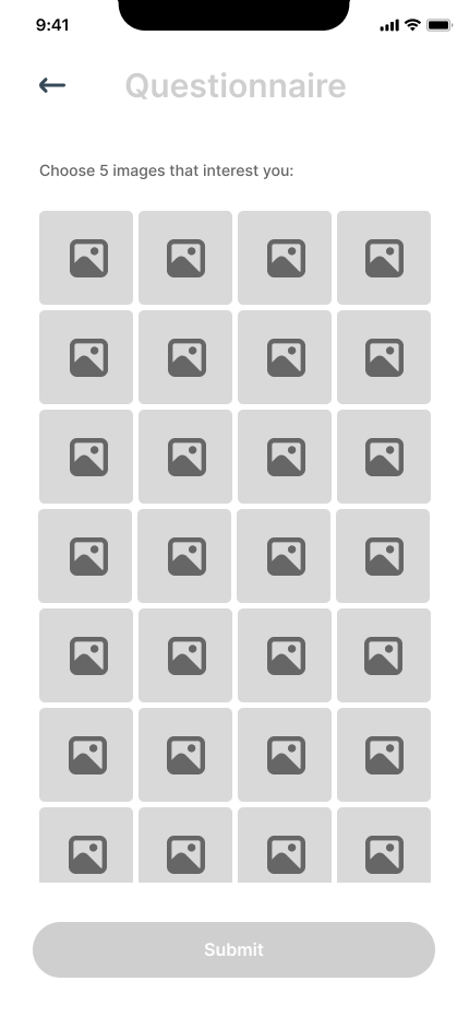
Questionnaire Pt.2

Personalised Homepage

News
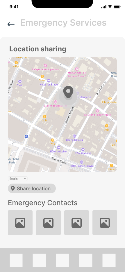
Emergency Services
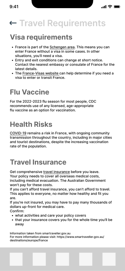
Travel Requirements
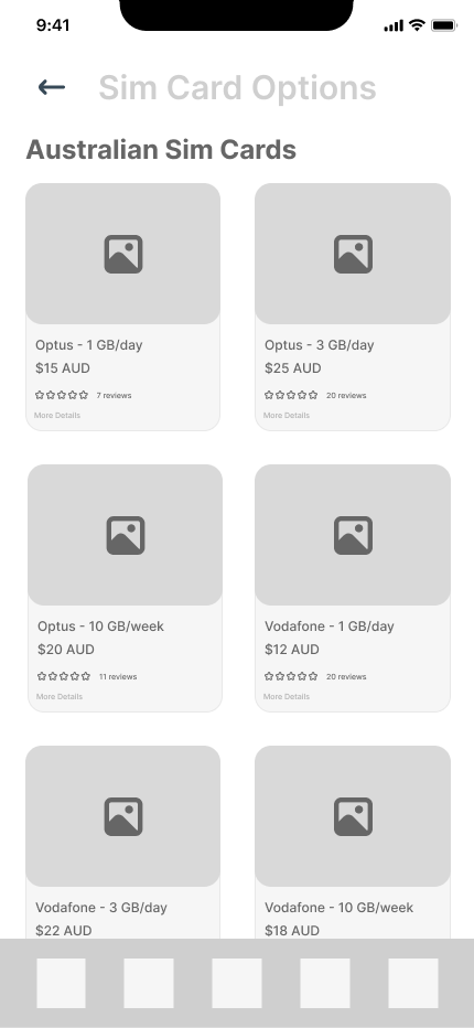
Sim Card Options

Safety Zones
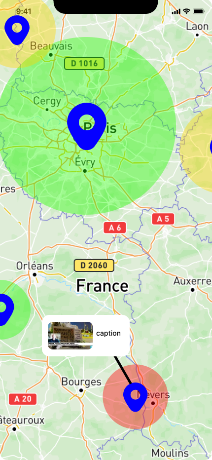
Safety Zone Zoomed In

Personalised Recommendations
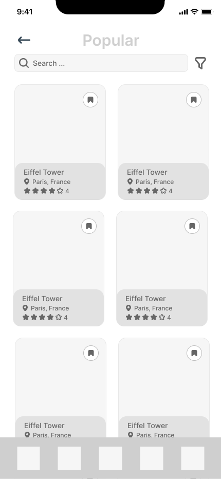
Local Recommendations

Recommendation
USER FEEDBACK
To iterate and enhance the low-fidelity prototype, I conducted usability studies to gain a deeper understanding of users' mental models and address any pain points in the subsequent iteration. Here is the first round of usability studies:
WHAT NEEDS TO BE IMPROVED MOVING FORWARD
The following changes were our focus to enhance the usability and user experience:
Design Consistency
Address inconsistencies in design across specific sections to reduce confusion during navigation and Use consistent fonts, colors, and spacing throughout the interface to create a sense of familiarity and order.
Prioritise User Flow
Design the interface around common user tasks and make it easy for users to accomplish their goals with minimal steps, anticipate user needs and offer clear visual cues.
Focus on Clarity
Group related options together and use clear, concise labels and minimise cognitive load by prioritising important elements, keeping the layout clean and uncluttered and not overwhelming users with too much information or options at once.
Emphasise Feedback and Control
Provide immediate feedback to users, give users the ability to correct mistakes and make navigation intuitive by using familiar gestures for scrolling, clicking, and dragging.
BRAND & VISUAL IDENTITY
Prior to developing the hi-fidelity prototype, we decided on a visual identity that would appeal to our target demographic of adventurous travellers who prioritise fun, independence and freedom.
We came up with the name SoloMontage as a play-on our mascot’s name (Solomon) and the joy and discovery that can occur from travelling solo.
We decided on a playful, Duolingo-inspired aesthetic with a vibrant colour scheme and bold font pairing to match the fun and playful mood. The contrasting colours will enhance readability. The bold header font of Titan One adds to the adventurous, game-like style of the app whilst the secondary font Open Sans prioritises clarity and roundedness.
ITERATING IS A CRUCIAL PART OF DESIGN BECAUSE INITIAL SOLUTIONS RARELY ADDRESS THE ROOT OF THE PROBLEM.
Each iteration of the prototype made significant strides based on the user feedback, with the final version boasting refined features, enhanced personalisation and streamlined user flows. Unnecessary steps were meticulously eliminated, making for a more seamless experience.
Iterating involves revisiting the question and research to ensure changes address user needs and solve the identified problems.
Here are the changes and rationale behind significant design choices for each round of iterating:
HOW DID USERS RESPOND TO CHANGES?
For each iteration, I conducted usability studies to gain a deeper understanding of users' mental models and address any pain points for the final design outcome. Here’s the feedback from the second round:
PART 05: DELIVER
Final Design Outcome
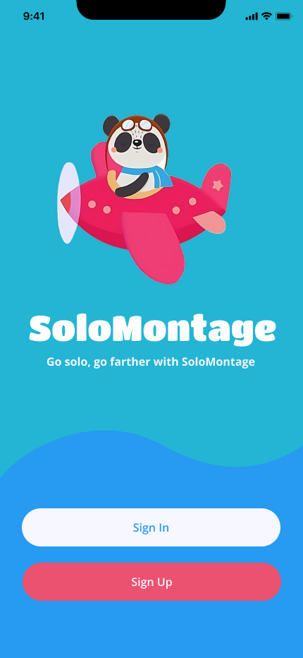
Title Screen

Welcome
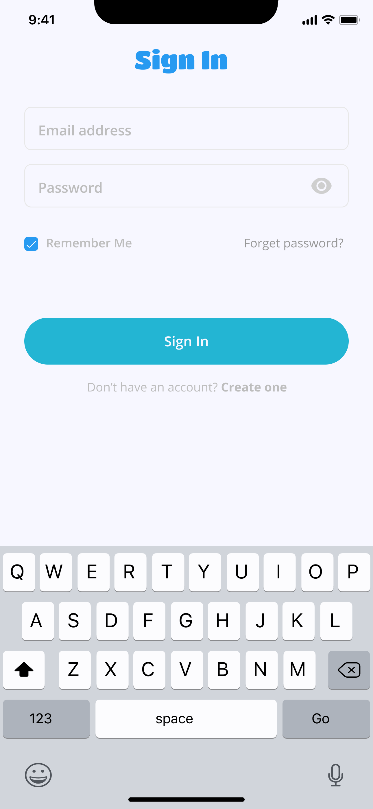
Sign In
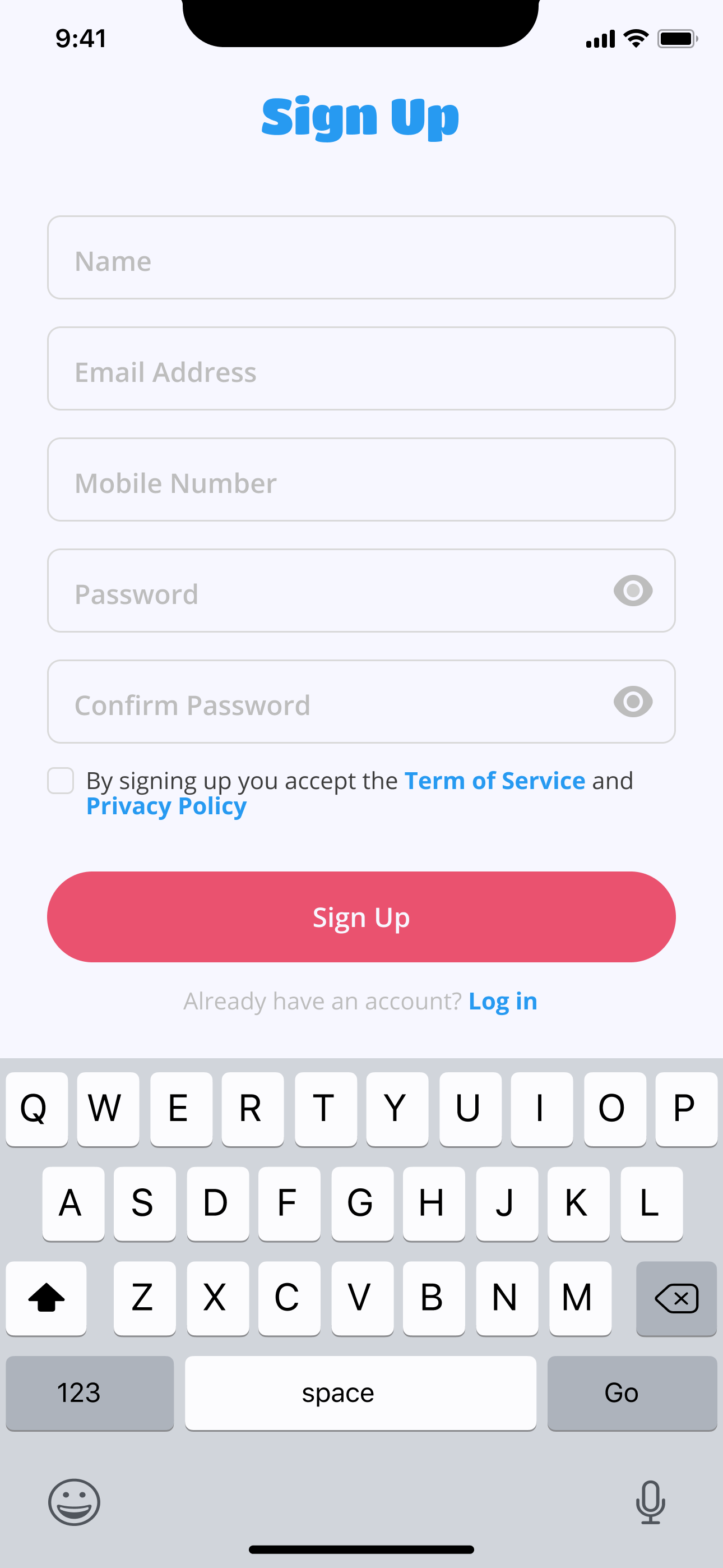
Sign Up
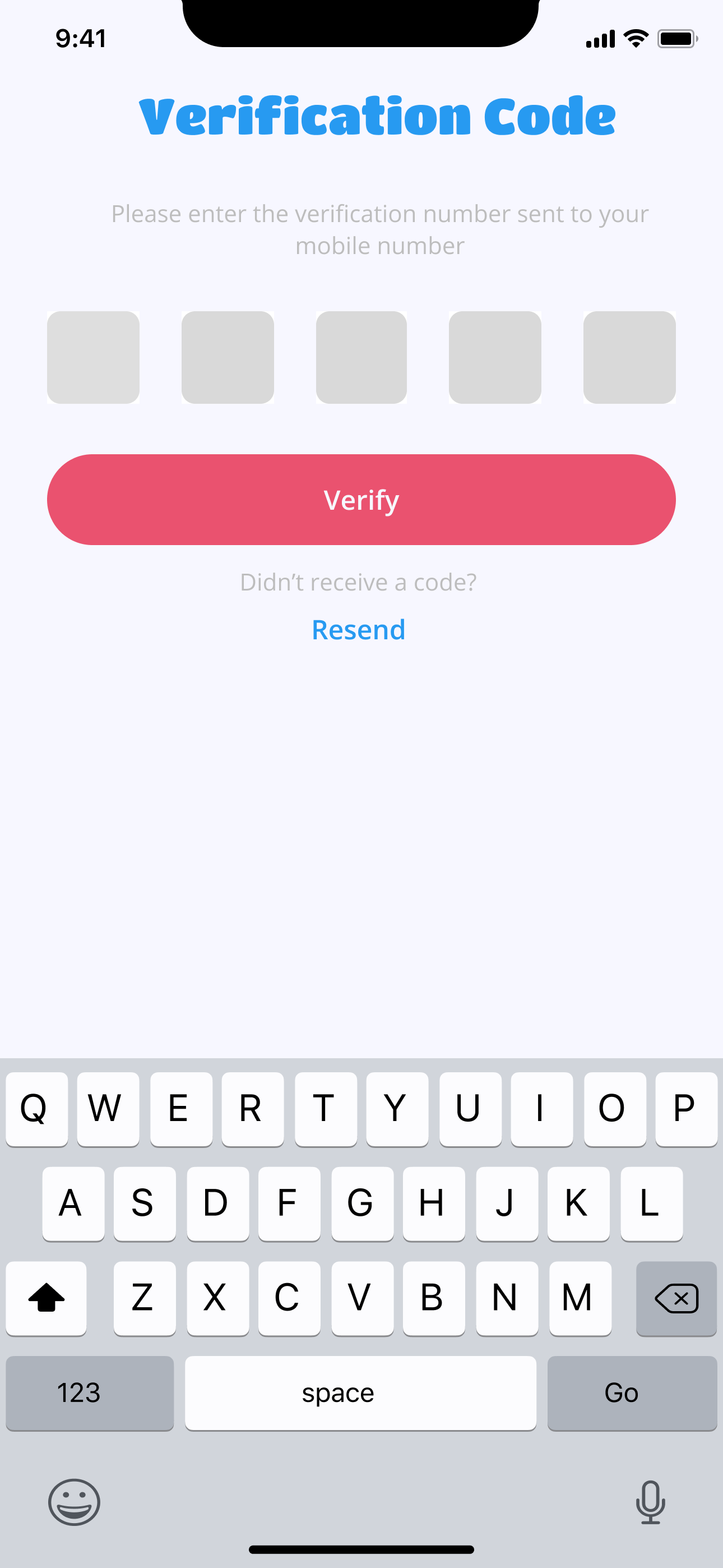
Verification

Questionnaire
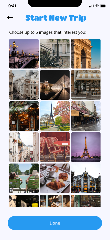
Questionnaire Pt.2
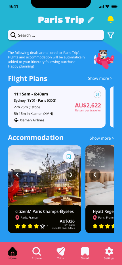
Homepage
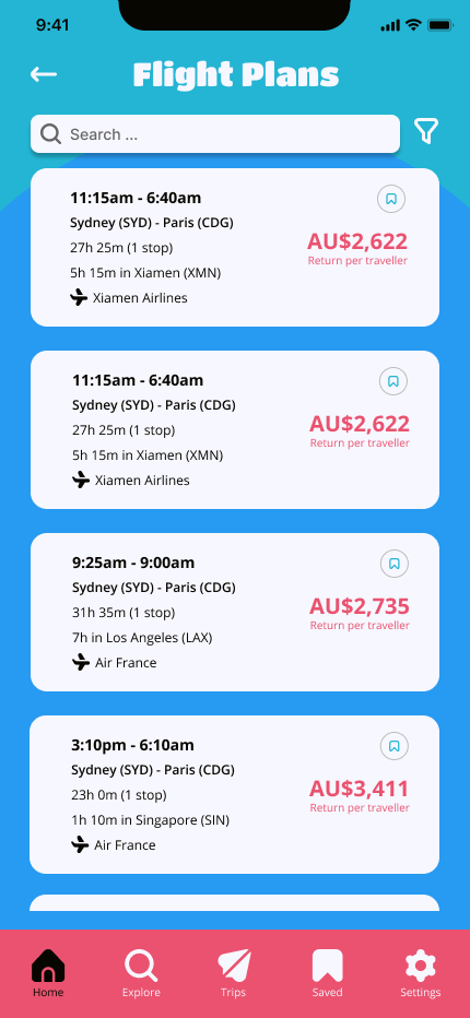
Flight Plans
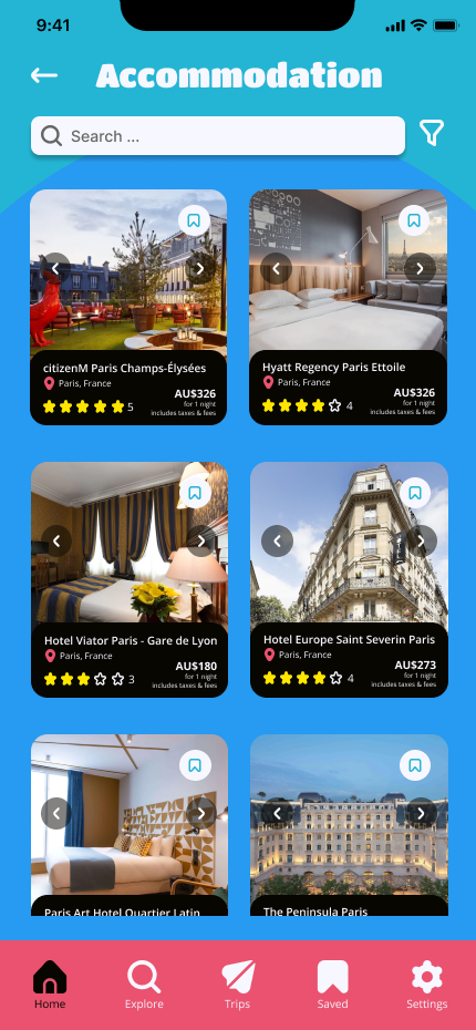
Accommodation Options
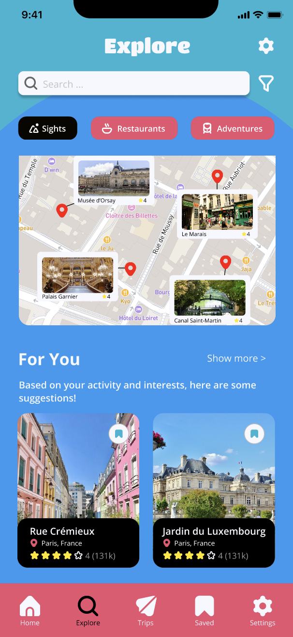
Explore Recommendations 2
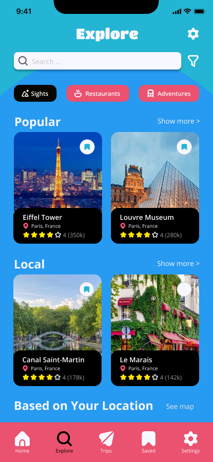
Explore Recommendations
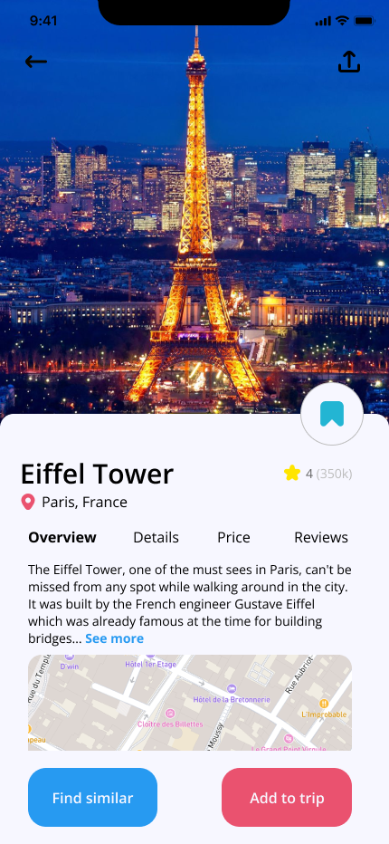
Eiffel Tower Overview
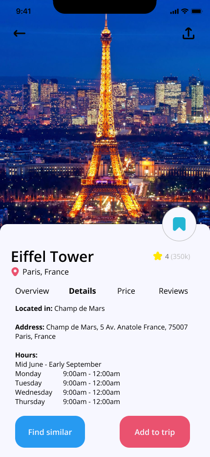
Eiffel Tower Details
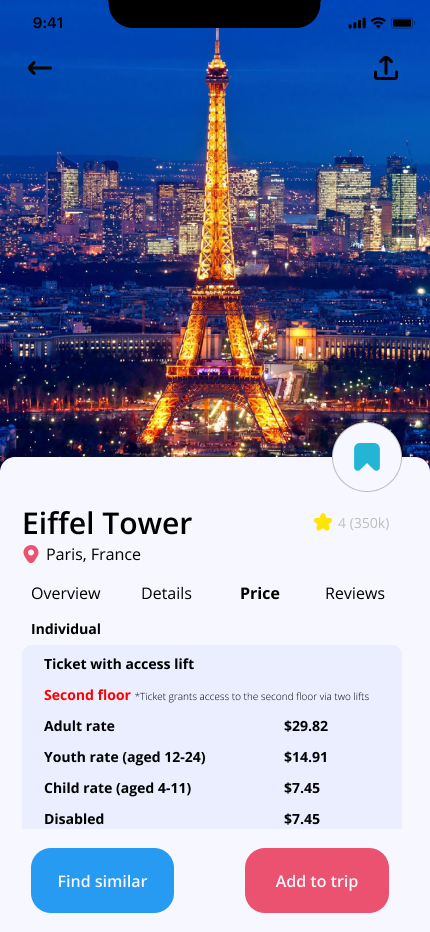
Eiffel Tower Price
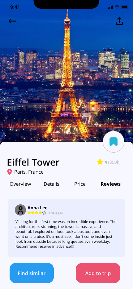
Eiffel Tower Reviews
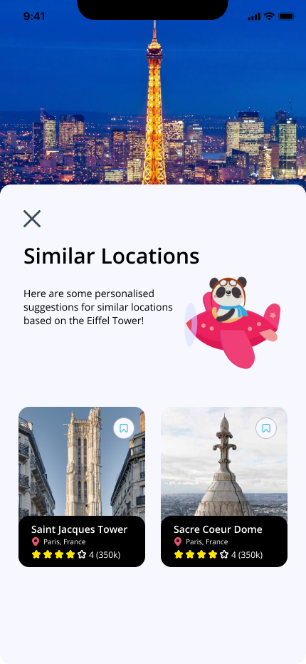
Similar Locations
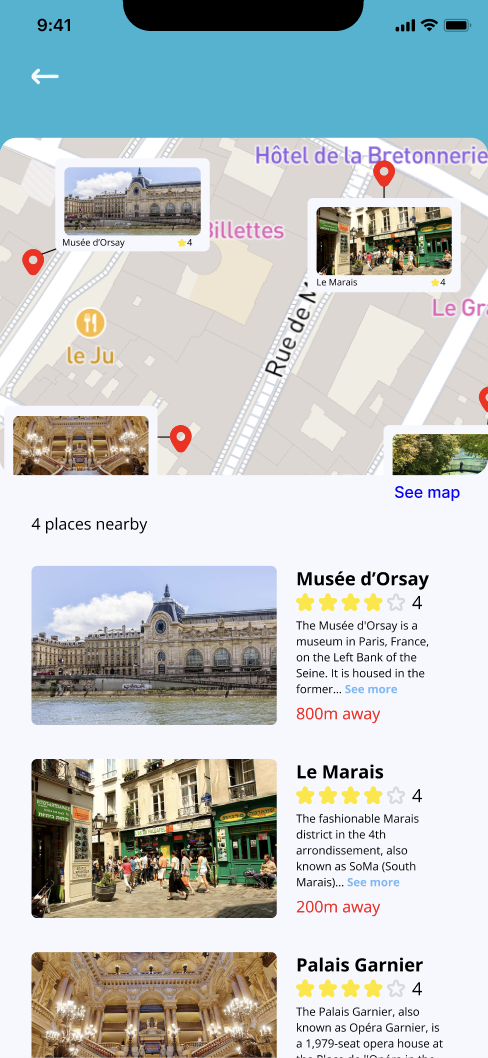
Explore Nearby
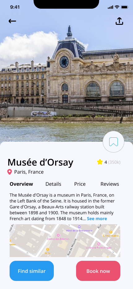
Mussee d'Orsay Overview

Popular (Show More)

Trips
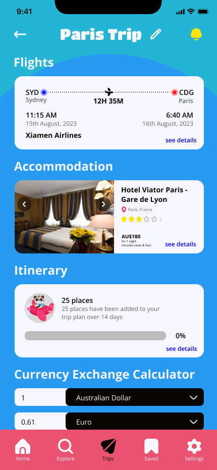
Paris Trip Overview
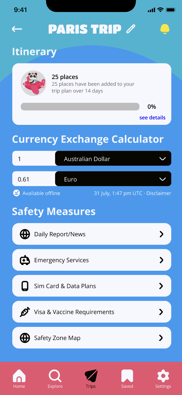
Paris Trip Overview 2
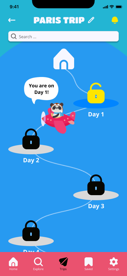
Itinerary Tracker
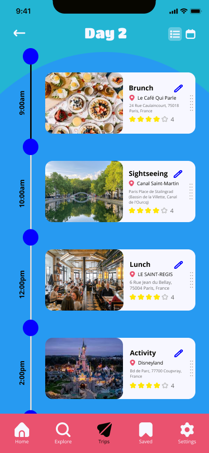
Itinerary
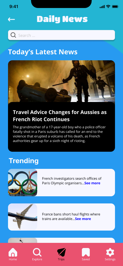
News
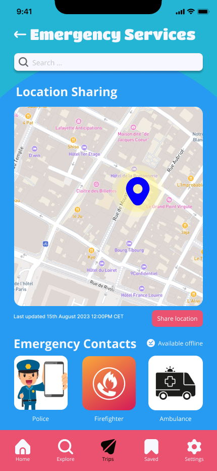
Emergency Services
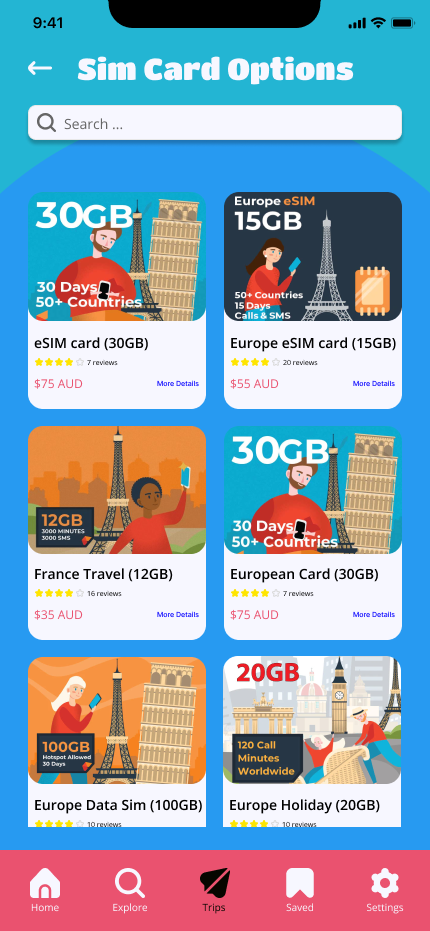
Sim Card Options
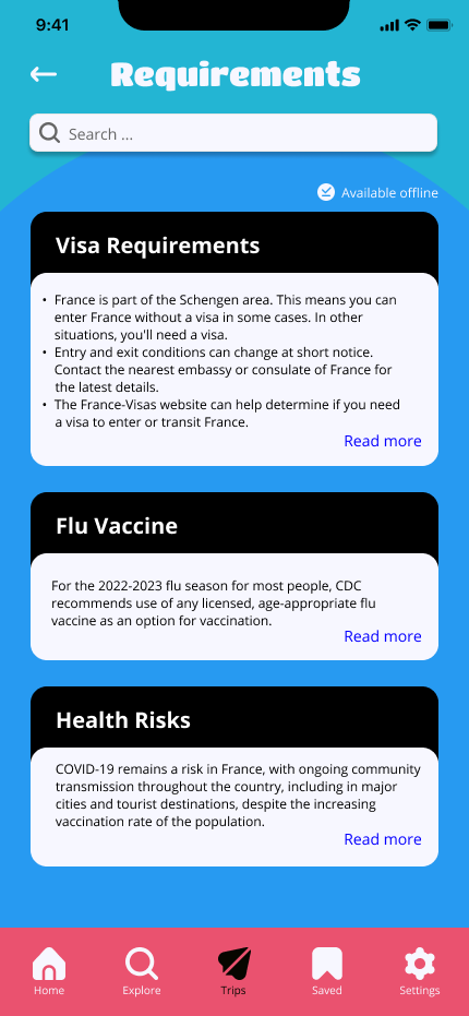
Travel Requirements
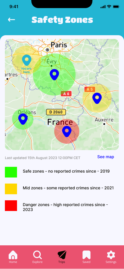
Safety Zone Map
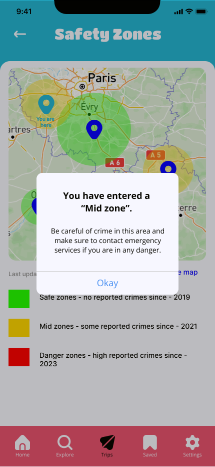
Safety Zone Alert

Saved Places

Saved Flights

Saved Accommodation
PART 06: DELIVER
Key Features
01
SIGN UP AND QUESTIONNAIRE
Users can sign up and save their information for convenient access to current trip plans and upcoming trip information. Following sign-up, users are navigated to a questionnaire designed to generate a personalised home page to help initiate trip planning, based off logistics and preferences.
02
PERSONALISED HOMEPAGE
SoloMontage’s personalised home page assists in enhancing users’ travel experiences, with flight and accommodation suggestions detailing relevant information and ratings so users can make optimal choices.
03
EXPLORE LOCAL RECOMMENDATIONS
SoloMontage’s explore page allows users to freely browse suggested local recommendations, categorised into sights, restaurants and activities. Users can search for alternative options from the personalised homepage and customise their itineraries during the trip, with the option to explore based off location, enabling flexibility.
04
TRIP OVERVIEW
The trips section is where new trips can be created and where past and future trips can be viewed. A holistic overview of trips are provided in chronological order: flight and accommodation information, itinerary organised by AI, currency exchange calculator and important safety features such as daily news/reports and safety zones. The itinerary is displayed via an intuitive and visually engaging path.
05
SAVED OPTIONS
The saved section is where users can collate places, flights and accommodation options that were saved whilst browsing, allowing them to narrow down and make decisions at a later time.
PART 07
Key Takeaways
This project helped strengthened my ability to work in a team and encouraged me to think outside the box to approach a solution to a problem in a saturated industry
A clean and organised design system and use of components are essential for consistency and time efficiency. So much time was wasted due to a lack of components, categorisation and naming.
This project reemphasised the important of extensive market research, user research and testing to ensure the product is desirable and relevant
Conducting research on a unique, niche user group - solo travellers - was interesting to discover their diverse perspectives
FURTHER DEVELOPMENTS
Usability Testing
I’d like to conduct more usability testing on the high fidelity prototype with a more diverse user group to further refine the design.
User Research
I want to conduct more user research with a more diverse group of travellers to further my understanding of user needs.
Virtual Tour Guides
With more time and resources, I’d like to introduce an interactive virtual tour guides feature. Travellers could be accompanied throughout their journey - guides providing historical context, cultural insights, and relevant information about landmarks, enhancing the overall travel experience.
Integration with Smart Devices
I’d like to integrate SoloMontage with smart home devices and wearables to provide seamless connectivity and access to travel information on-the-go.


