


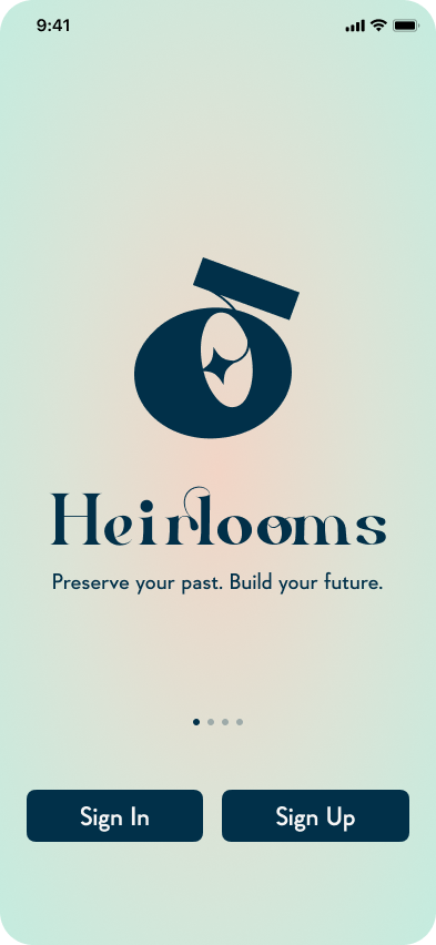
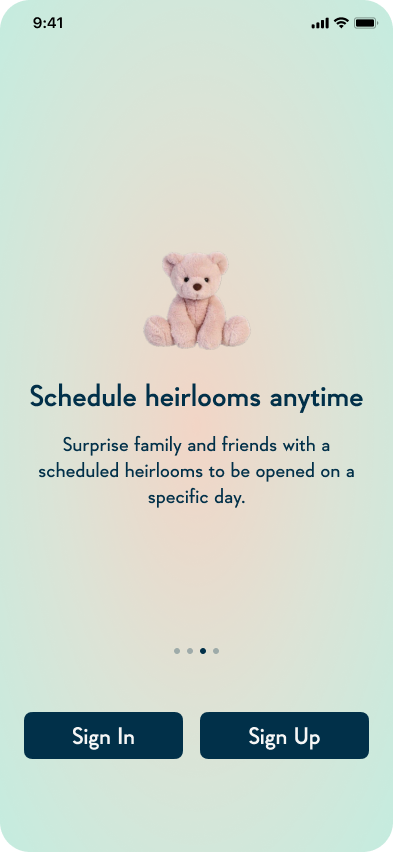
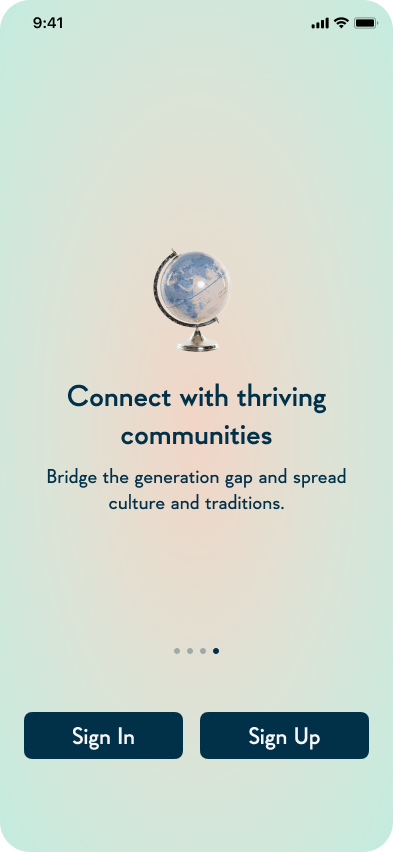
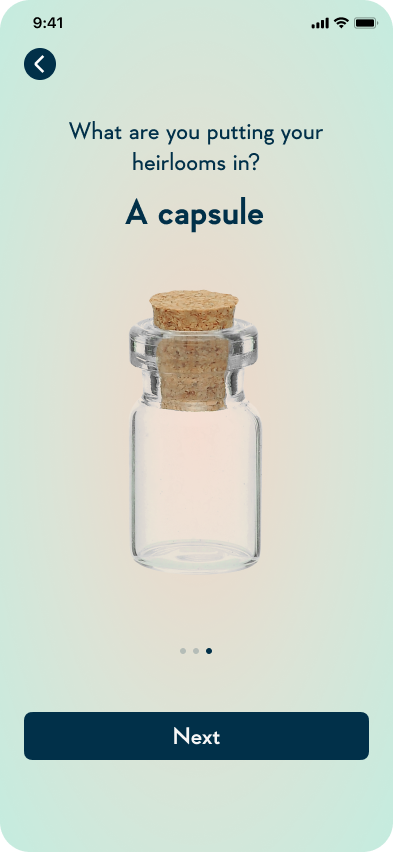
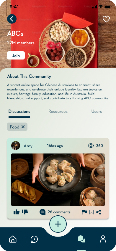
Heirlooms

Heirlooms is a digital time capsule designed to bridge the cultural and generational divides families face today by creating a shared space to contribute memories, stories, and traditions.

Team
Me
Duration
10 weeks

Role
UI designer, UX researcher

Tools
Figma, Illustrator
PART 01
Project Overview
WHAT’S THE PROBLEM?
30,000 digital photos. A phone filled with cluttered, disorganised memories with no substance or considered documentation. Expensive photo albums that get lost during the move.
The generational gap widens – forgotten childhood stories, fading cultural traditions, and the precious memories of our elders slipping away. This resonates with so many of us. We juggle busy lives, and connections with loved ones can fray.
BUT WHAT IF WE COULD BRIDGE THAT GAP?
Heirlooms isn't just an app; it's a digital time capsule designed to bridge the cultural and generational divides families face today. Inspired by the tangible sentimentality of a physical time capsule, Heirlooms creates a shared space for families to contribute memories, stories, and traditions.
Heirlooms was conceptualised in response to a deeply personal and widespread problem space: the growing issues of cultural and generational disconnect, natural memory loss on a micro level, and cultural heritage erosion on a macro level.
In response to these prevalent issues, Heirlooms was conceptualised with the mission of "Preserve your past. Build your future”.
I adopted the double diamond design process, enabling a structured exploration of the problem followed by iterative development of potential solutions.
However, I discovered that the decision process isn’t always a straightforward journey and involves tweaks and adjustments to adapt to the uniqueness of problems and solutions.
PART 02: DISCOVER
Understanding the User & Space
DESK RESEARCH


PART 03: DEFINE
Interpreting Findings
USER TESTING


RAPID CONCEPT GENERATION


CONCEPT EXPLORATIONS


BRAINSTORMING


WHO ARE WE DESIGNING FOR AND WHAT IS THEIR JOURNEY?
To hone in on who we’re designing for, I envisioned personas of our ideal user using the insights gathered from desk research. This serves as a guide to our design decision to ensure that we’re constantly thinking about the users we’re targeting.
I also created user journey maps which focuses specifically on the potential emotions, thoughts users might undergo along with the opportunities for improvement.
The user flows I developed from the user journey map served as a guide for interactions and foundation for Heirlooms.
These methods helped facilitate the analysis and identification of critical challenges and pain points to mitigate in the development of our solution.

Persona 1

User Journey 1

Persona 2

User Journey 2

User Flow 1

User Flow 2
Sketches
Following another round of user feedback, synthesis, and considered decision-making, I translated the refined user flow into sketches. These sketches visually exhibit a smoother user experience targeted at a more defined audience.


Don’t forget to rest your eyes and take a break from scrolling…

PART 04: DELIVER
Wireframing, User Testing & Iterating
Wireframes
→
User Test
→
Visual Identity
Mid-Fidelity
→
User Test
→
High-Fidelity
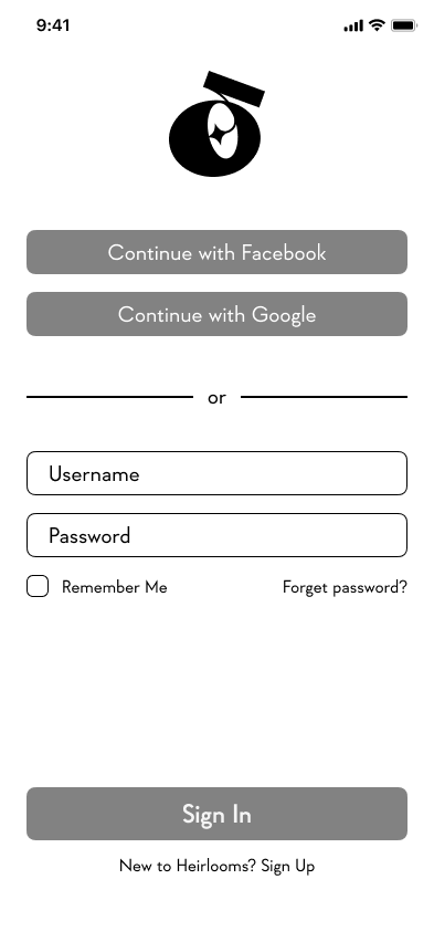
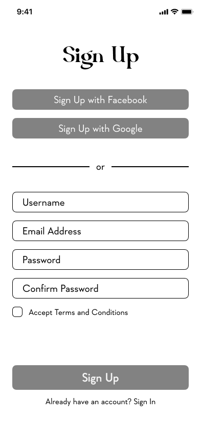
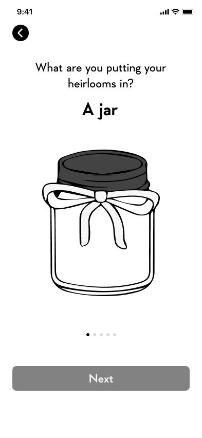
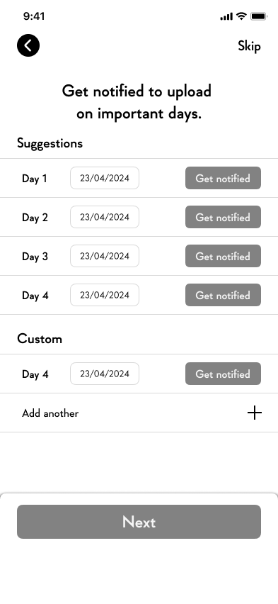
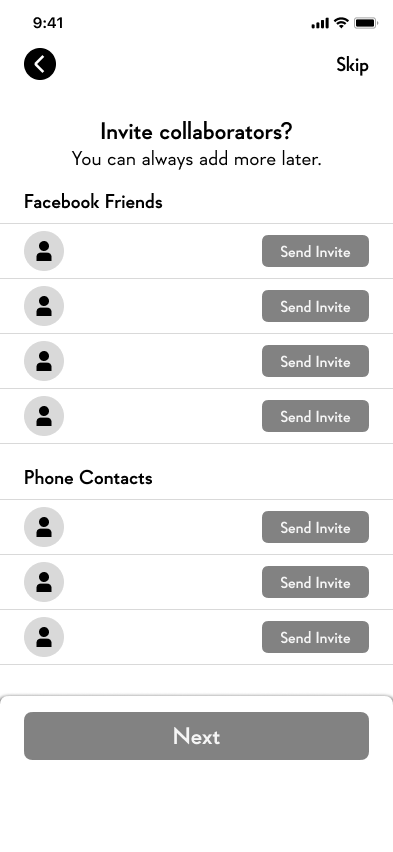
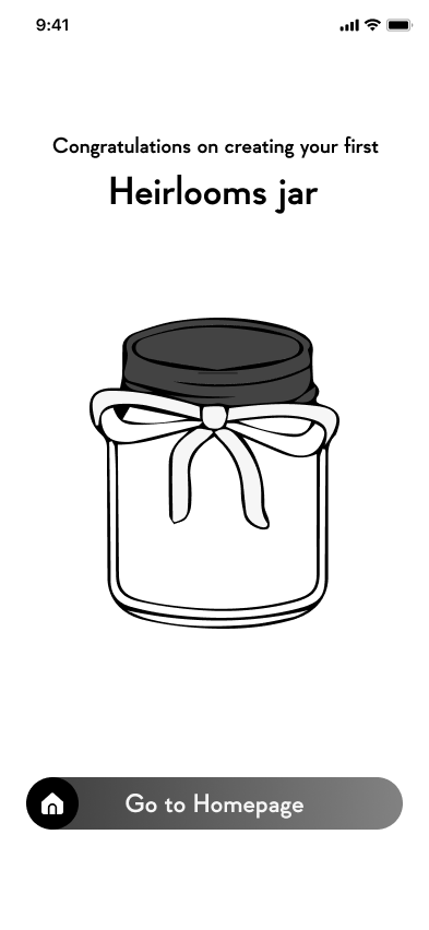
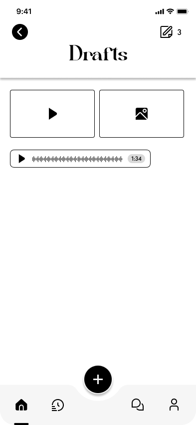
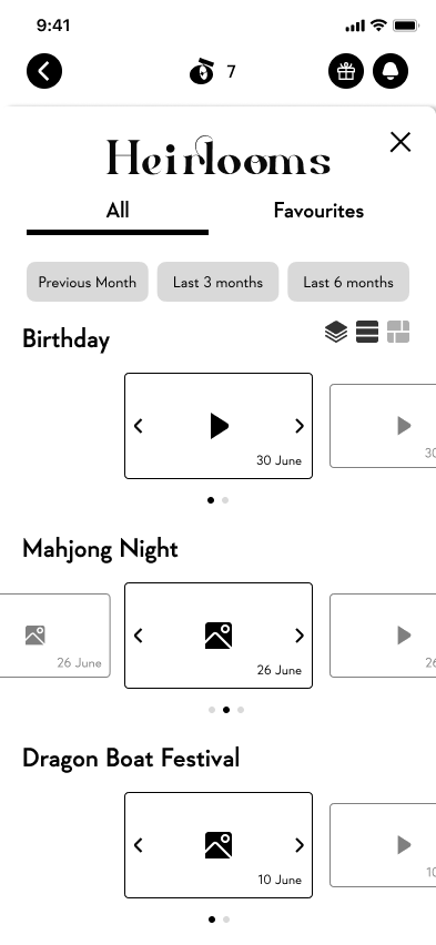
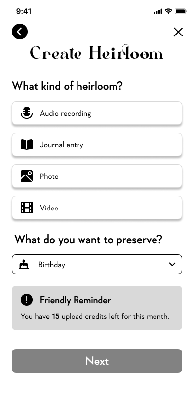
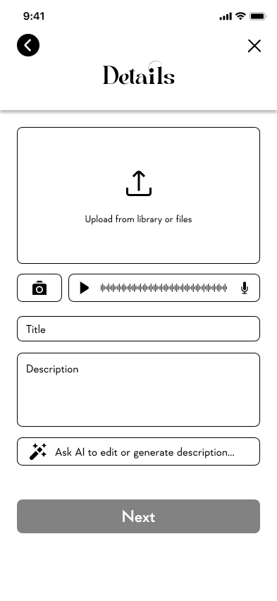
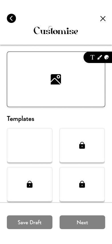
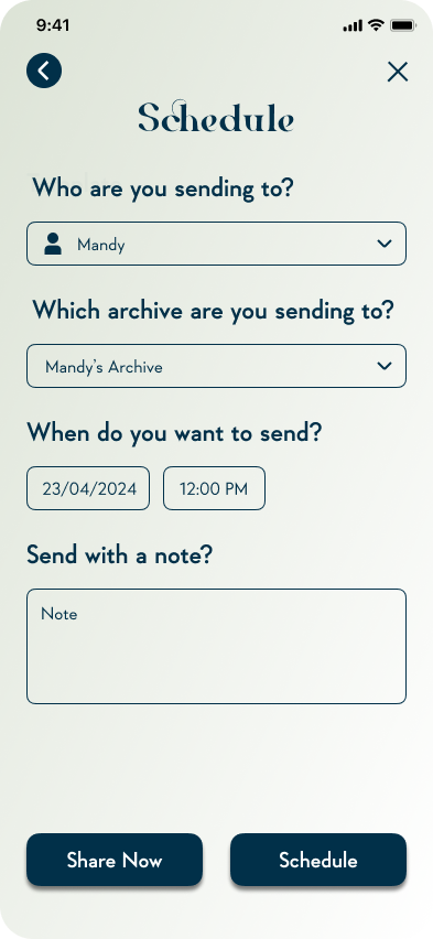
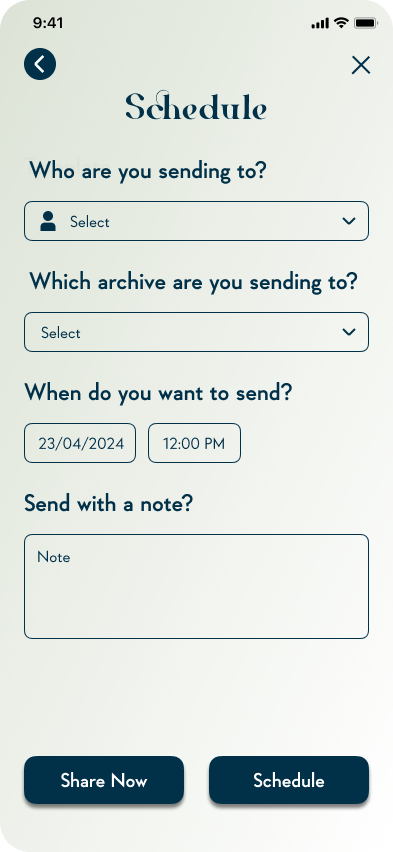
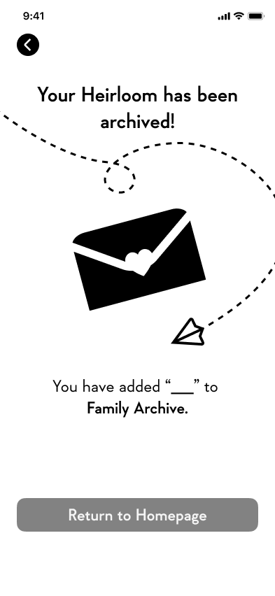
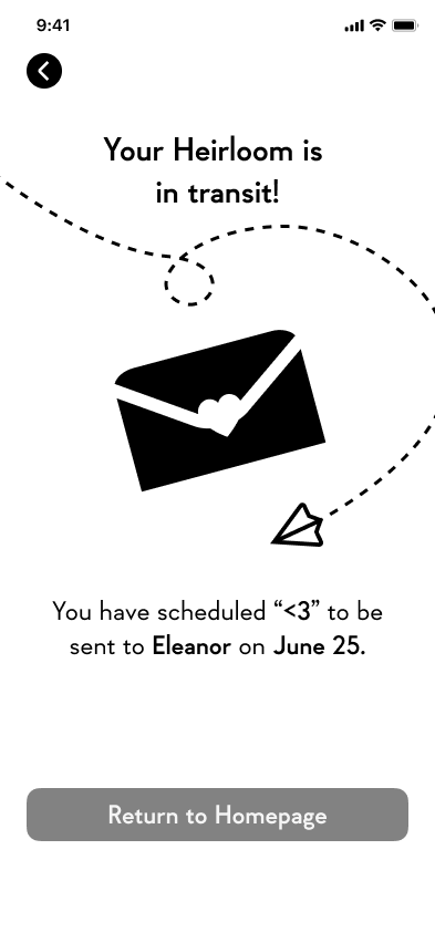
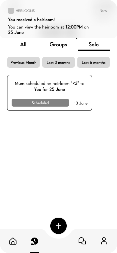
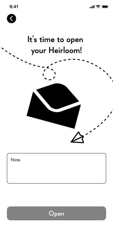
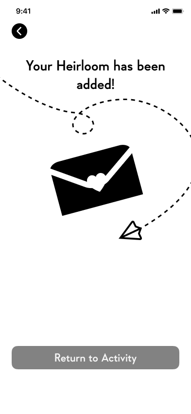
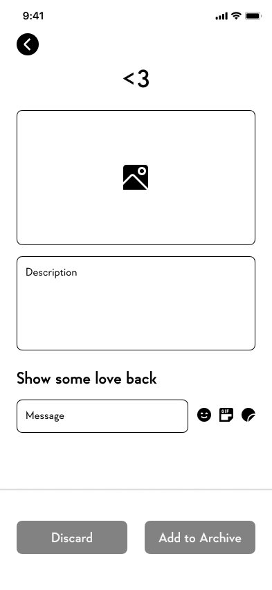
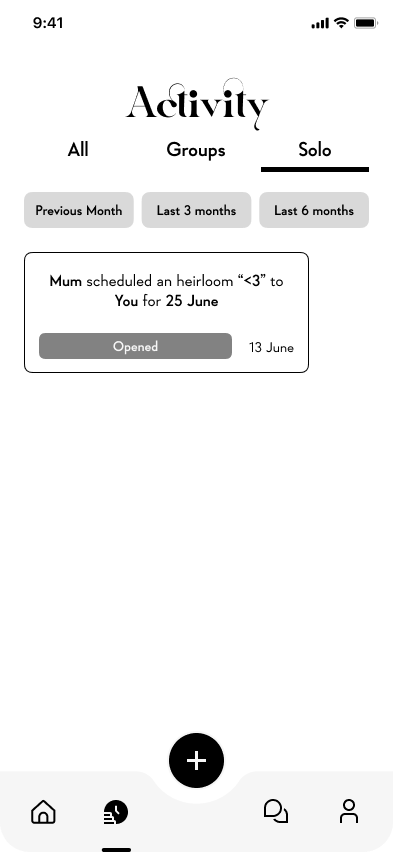
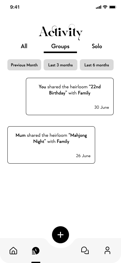
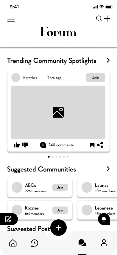
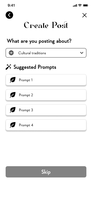
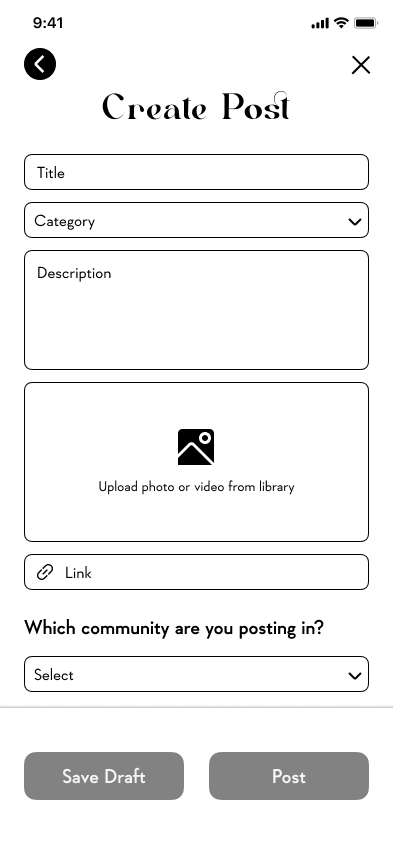
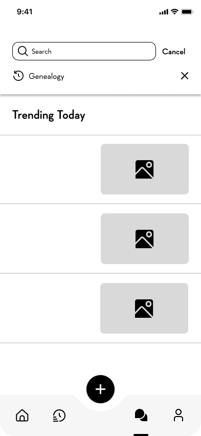
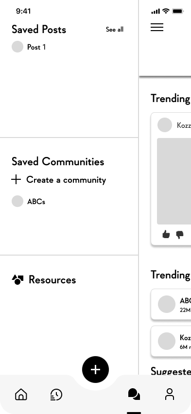
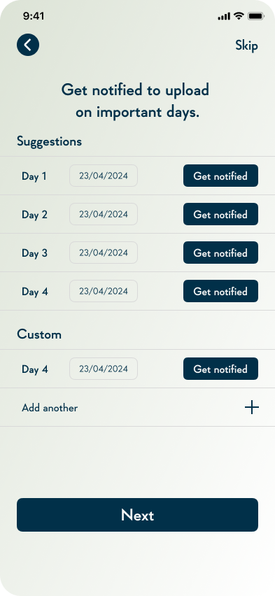
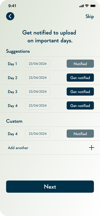
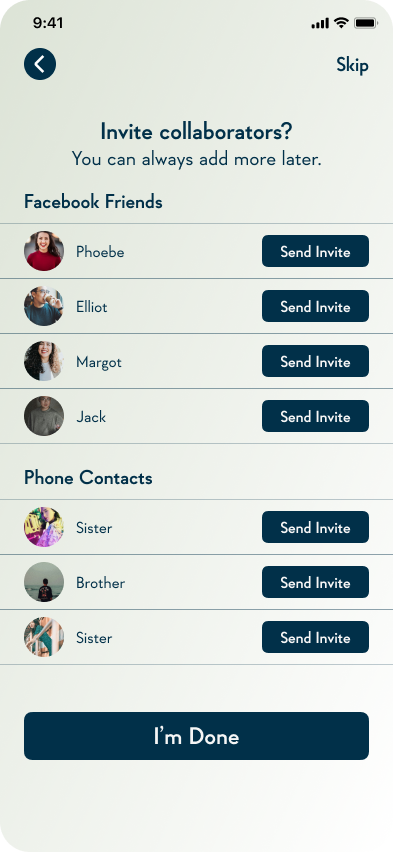
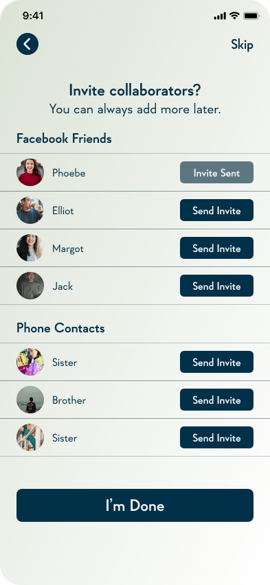
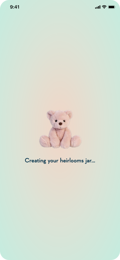
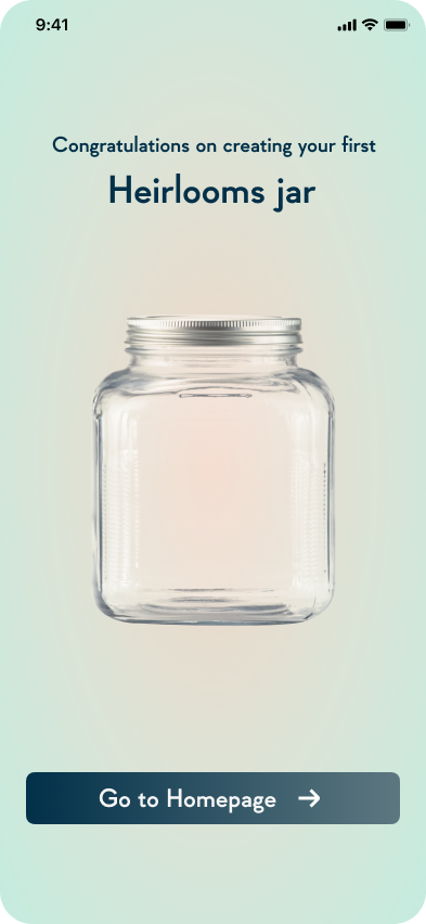
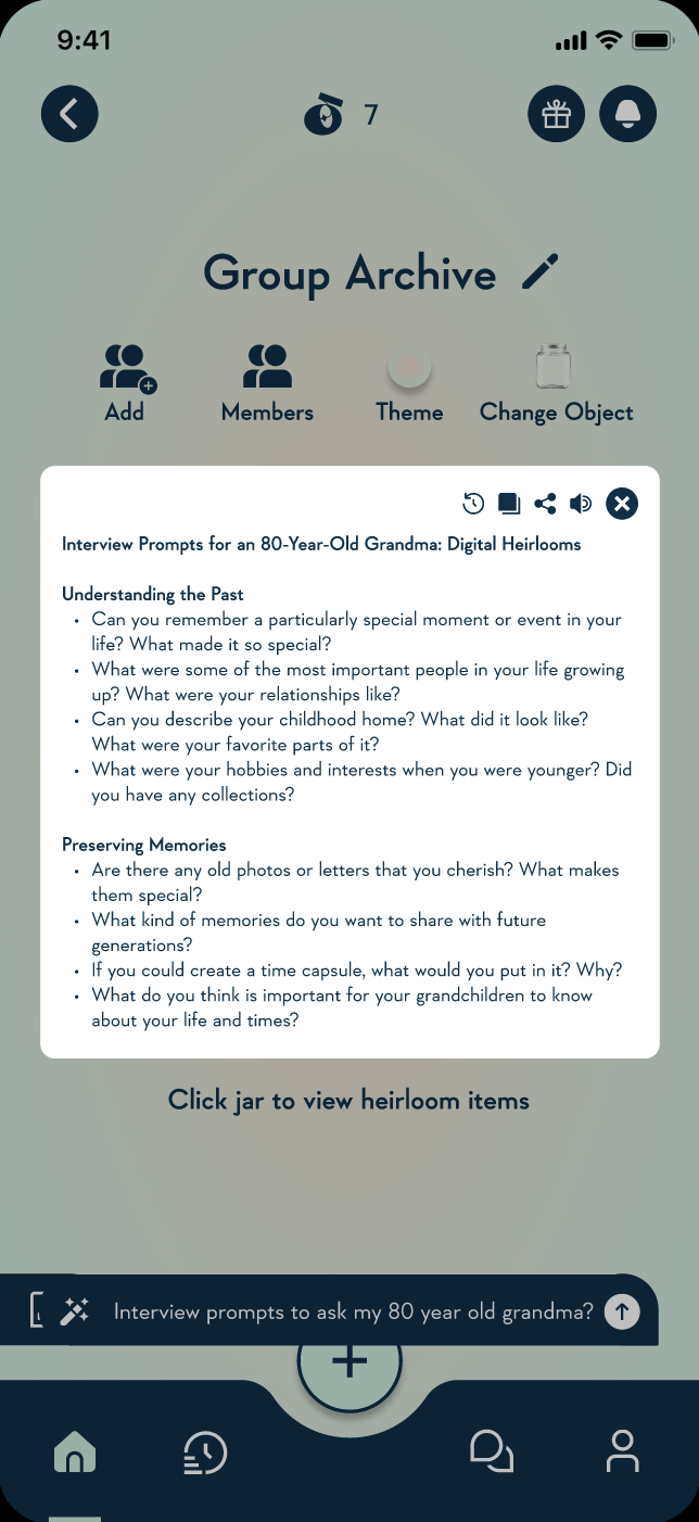
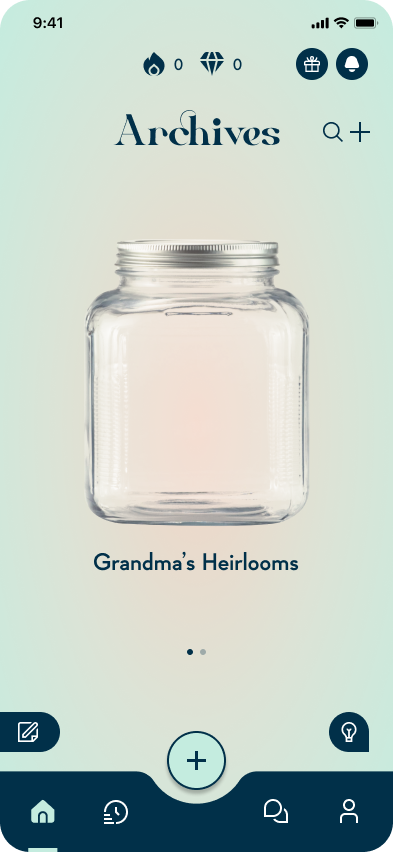
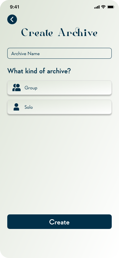
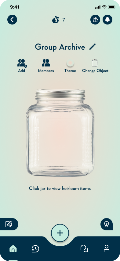
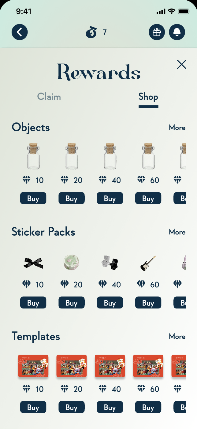
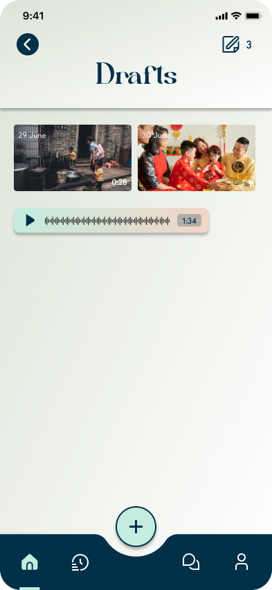
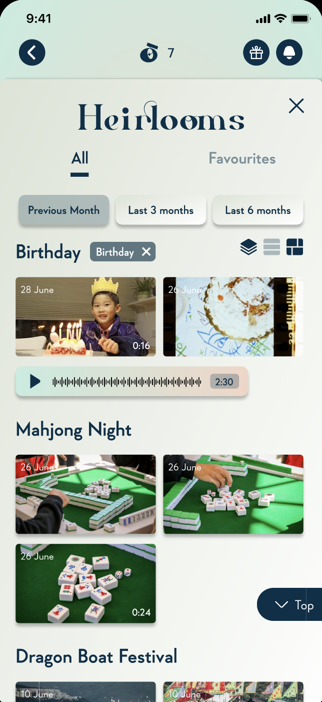
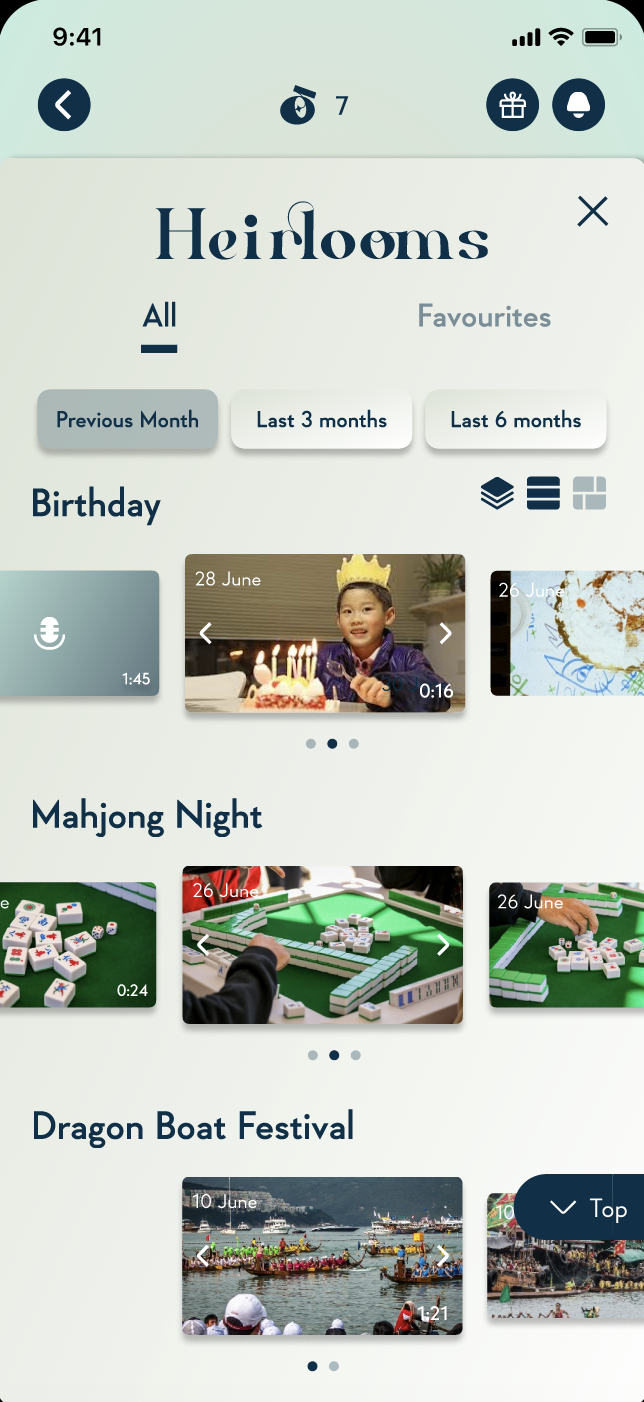
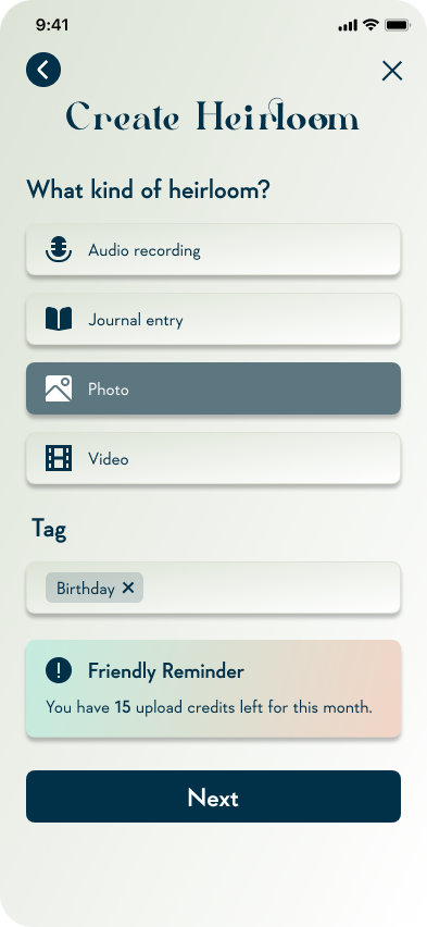
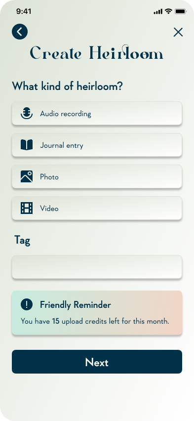
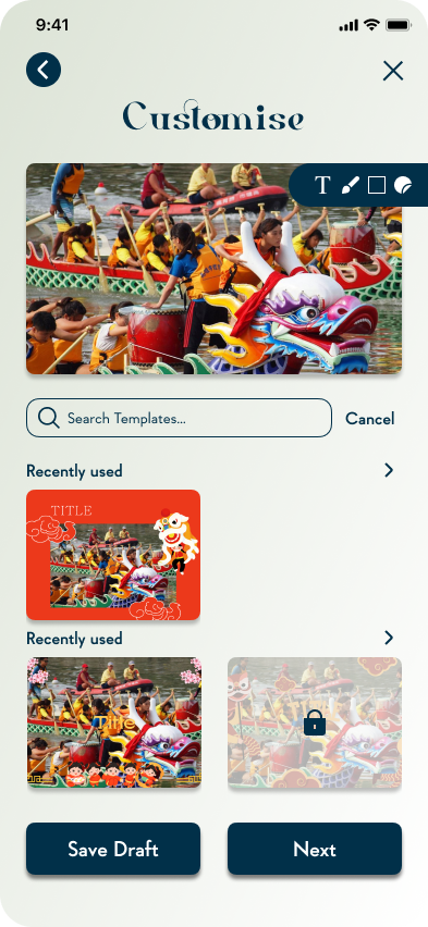
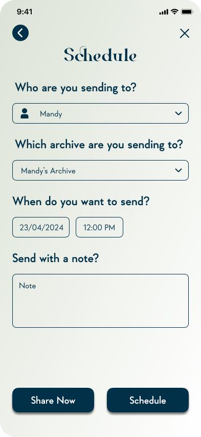
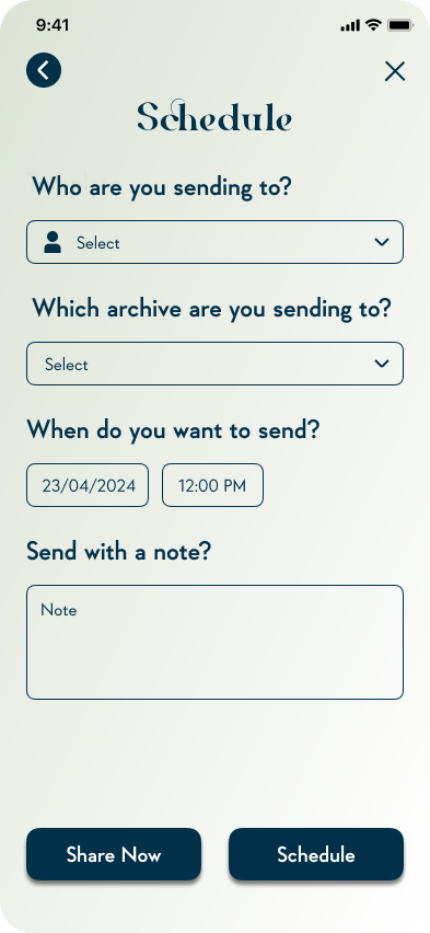
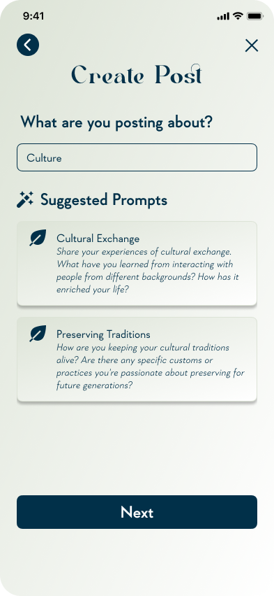
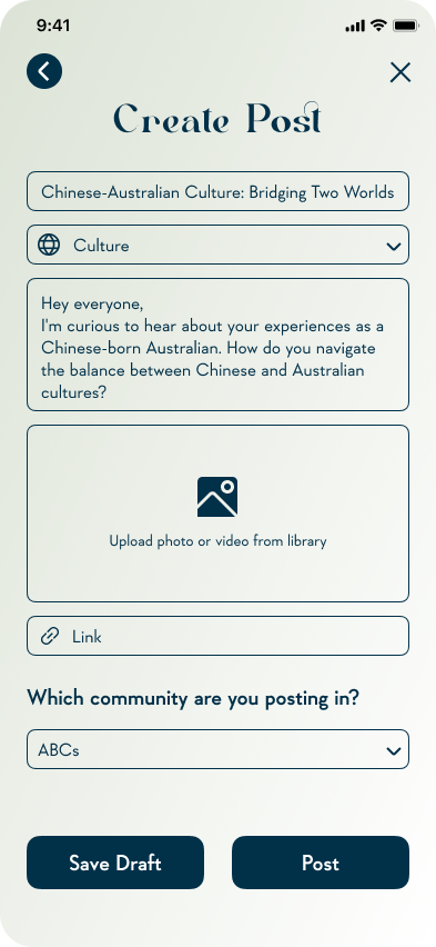
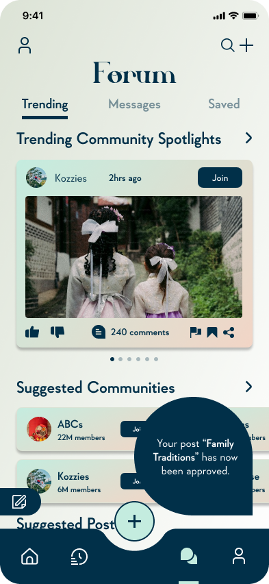
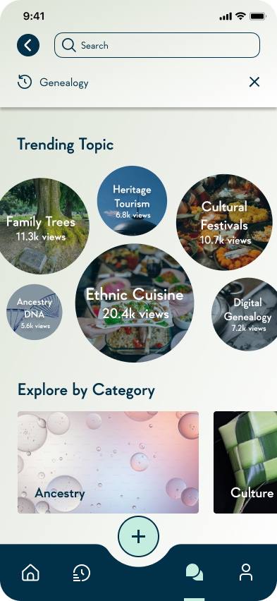
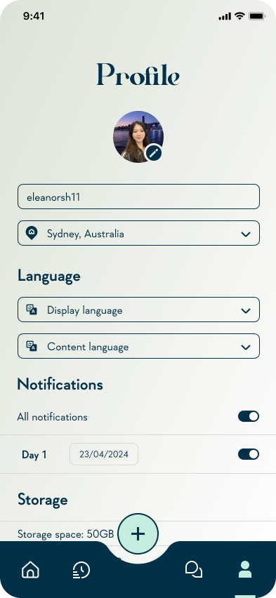
Final Design Outcome
WIREFRAMES
These wireframes elevate the sketches into a higher-fidelity format to illustrate the information architecture, layout, and refined user flow of Heirlooms. This builds upon and improves my previous wireframes, setting the foundation for future iterations and user testing.


USER FEEDBACK
To iterate and enhance the low-fidelity prototype, I conducted usability studies to gain a deeper understanding of users' mental models and address any pain points in the subsequent iteration. Here is the first round of usability studies:


BRAND & VISUAL IDENTITY


FOCUS GROUP REFINED

USER FEEDBACK


MID-FIDELITY PROTOTYPE
Part of the iterative process is to implement changes following testing and feedback rounds. Following another round of user feedback and experimentation, I refined my low-fidelity prototype into a mid-fidelity prototype.
ITERATING IS A CRUCIAL PART OF DESIGN BECAUSE INITIAL SOLUTIONS RARELY ADDRESS THE ROOT OF THE PROBLEM.
Each iteration of the prototype made significant strides based on the user feedback, with the final version boasting refined features, enhanced personalisation and streamlined user flows. Unnecessary steps were meticulously eliminated, making for a more seamless experience.
Iterating involves revisiting the question and research to ensure changes address user needs and solve the identified problems.
Here are the changes and rationale behind significant design choices for each round of iterating:


HOW DID USERS RESPOND TO CHANGES?
For each iteration, I conducted usability studies to gain a deeper understanding of users' mental models and address any pain points for the final design outcome. Here’s the feedback from the third round:


PART 05: DELIVER
Final Design Outcome


PART 06: DELIVER
Key Features


PART 07
Key Takeaways
The need for user interface design to directly reflect user wants, discoverable through testing. It’s important to not let personal bias take over.
Unrealistic to target a focus group with a large age range due to differences in tech-savviness.
FURTHER DEVELOPMENTS


Usability Testing
I’d like to conduct more usability testing on the high fidelity prototype with a more diverse user group to further refine the design.
User Research
I want to conduct more user research with a more diverse group of users to further my understanding of user needs.